
What does the page say first?
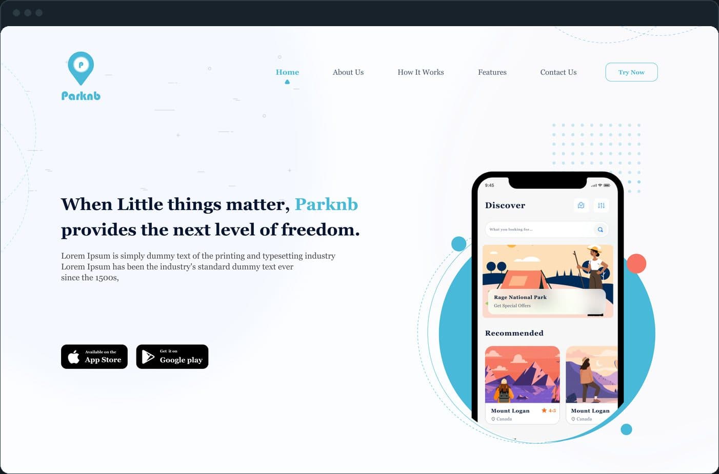
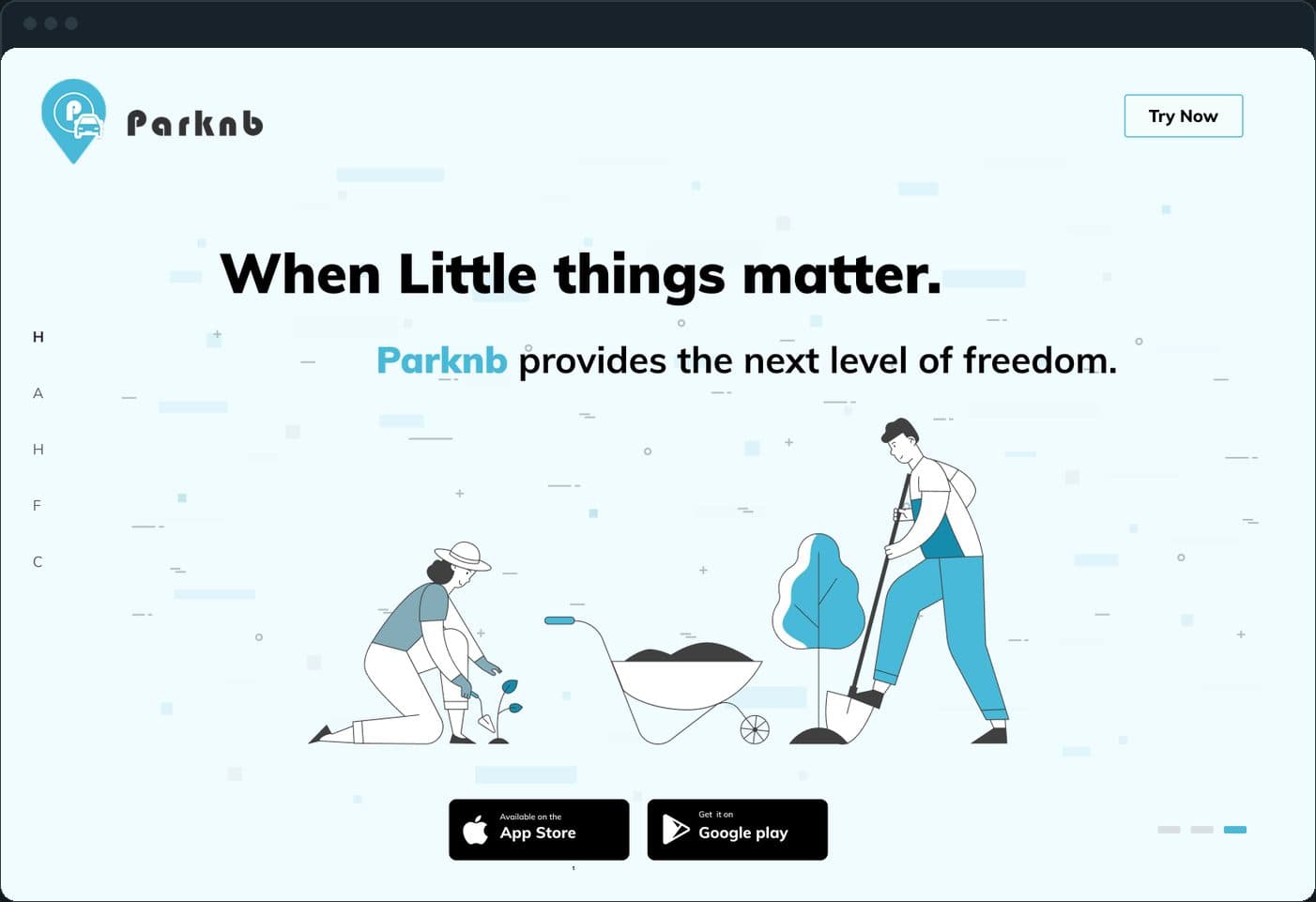
When little things matter, Parknb provides the next level of freedom: the headline beside the app on a phone, with the App Store and Google Play badges under the copy. The first screen says what the app is and shows it.
Website design for Parknb, a booking app: the hero in 3 directions with the app on a phone, 8 numbered features, 9 how-it-works steps and a contact form.
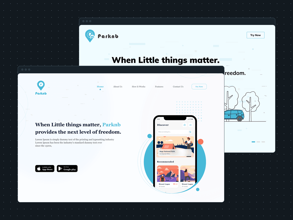
Parknb is an app for instant bookings of properties and events: parking spots, driveways, campsites and stays. Plainbuilt designed its landing page: the hero in 3 directions with the app on a phone, how it works in 9 steps, 8 numbered features and a contact form, in the product's blue line-illustration style. The comps below carry placeholder body text where the product's own copy goes; the footer in them is dated 2021.
The landing page, full stack: the hero with the app on a phone, the three directions it was designed in, the nine how-it-works steps, the eight numbered features and the contact form at the end, in the product's blue line-illustration style. The comps on this page are the designs the build followed.
When little things matter, Parknb provides the next level of freedom: the headline beside the app on a phone, with the App Store and Google Play badges under the copy. The first screen says what the app is and shows it.
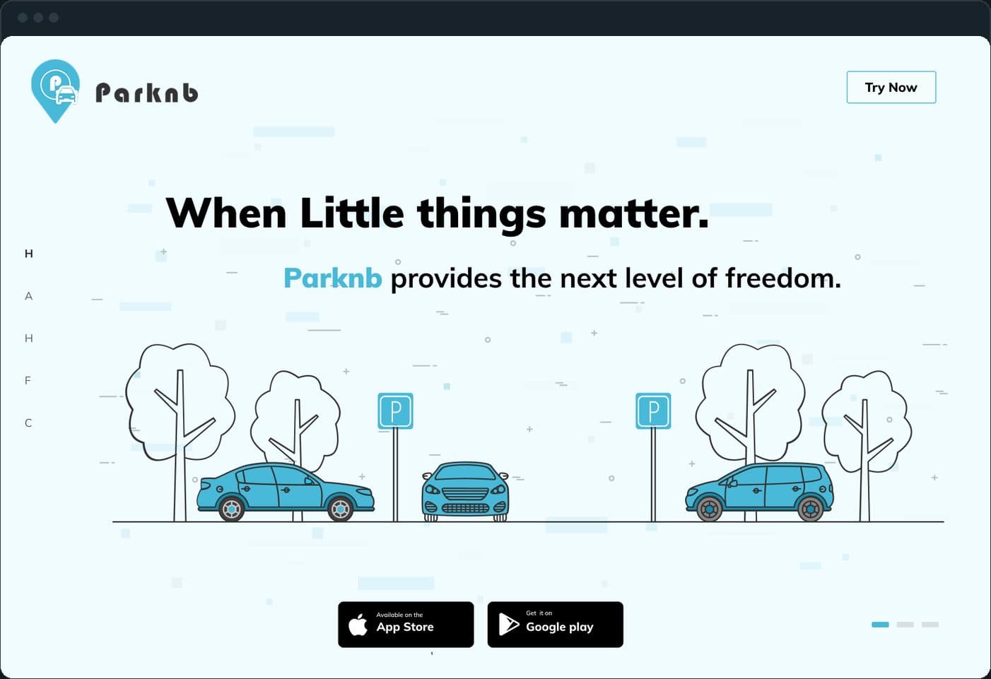
Three directions of the same headline were drawn (parking, camping, gardening), each in the product's blue line-illustration style, so the client could pick the story without changing the page underneath. Two are here; the third is in the screens below.

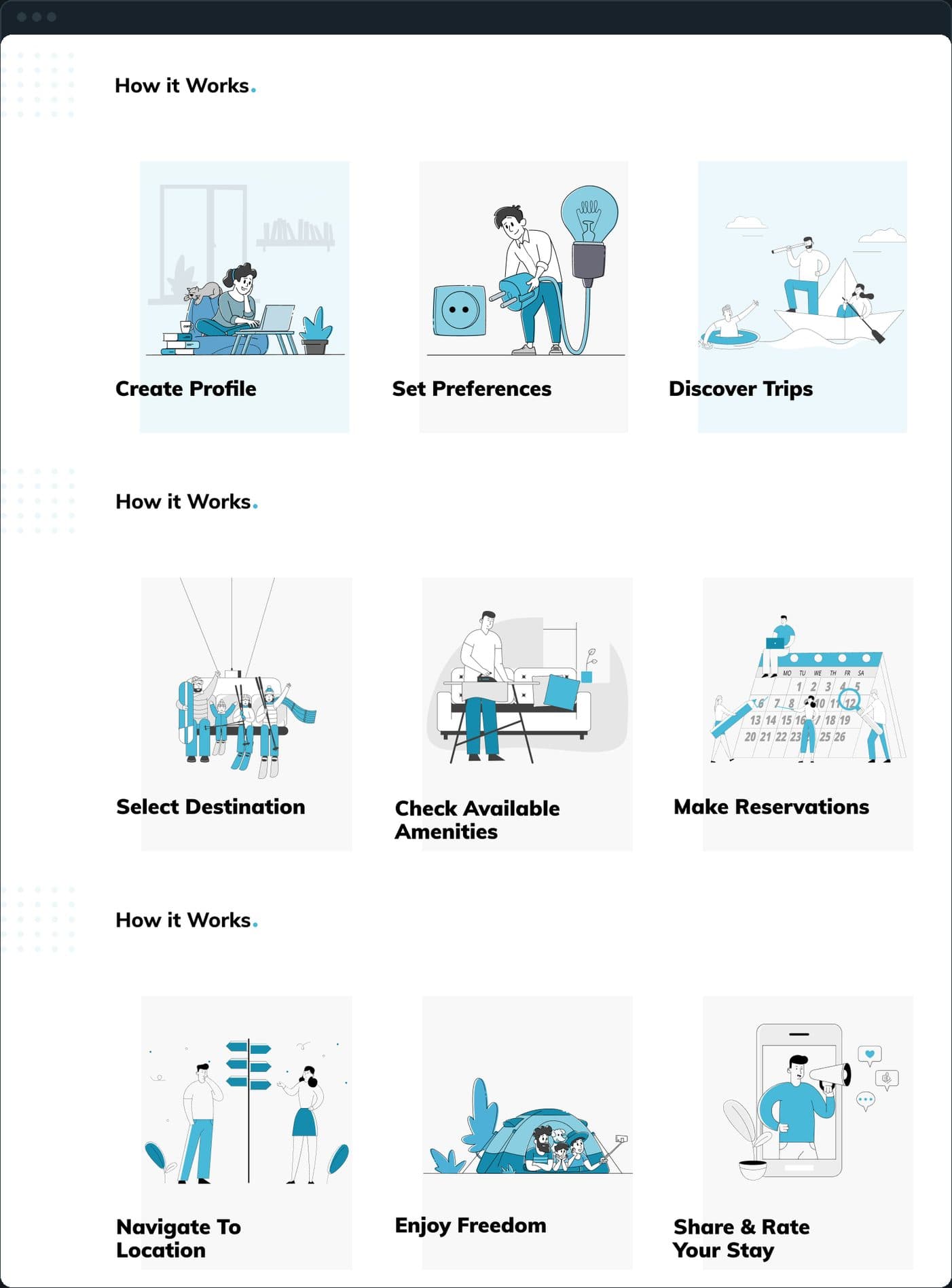
Nine steps in three rows of three: create a profile, set preferences, discover trips; select a destination, check the available amenities, make a reservation; navigate to the location, enjoy, then share and rate the stay. Each step is one illustration with a one-line label.
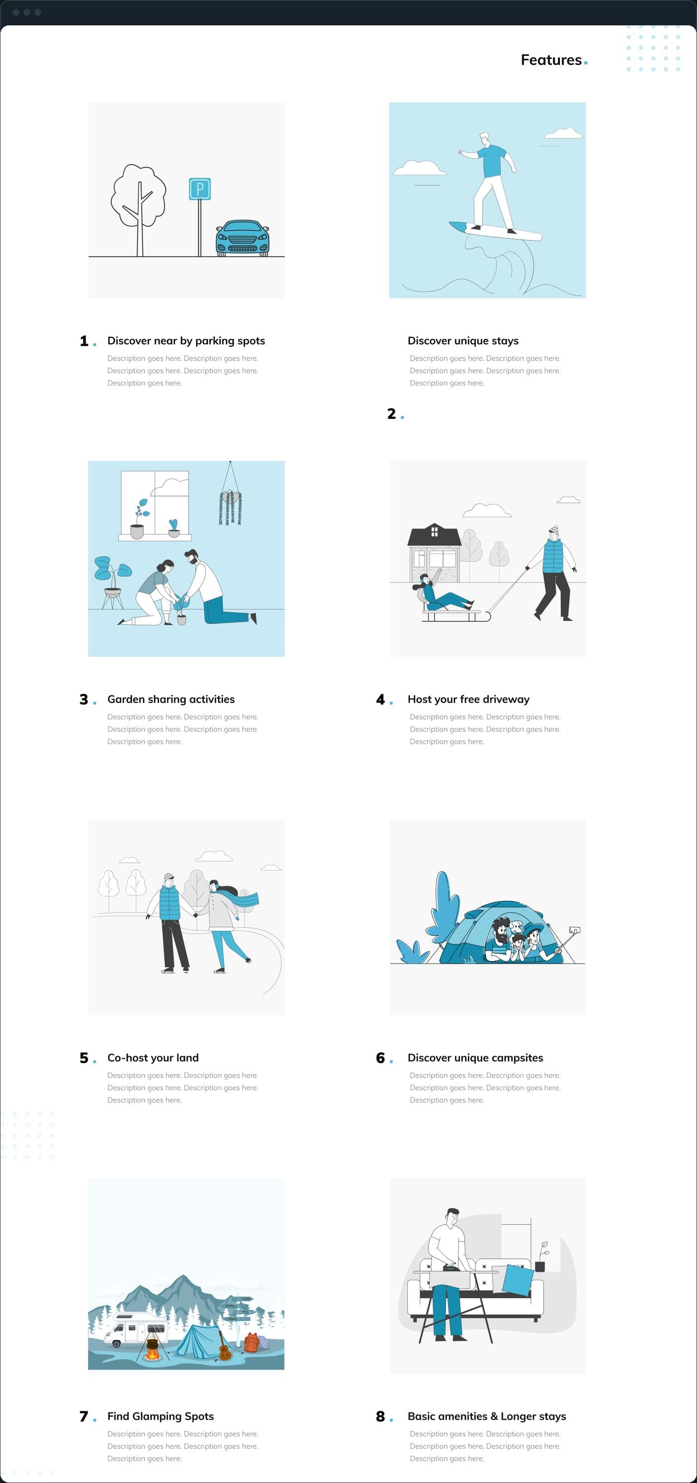
Numbered, two to a row, each with an illustration: discover nearby parking spots, discover unique stays, garden sharing activities, host your free driveway, co-host your land, discover unique campsites, find glamping spots, and basic amenities and longer stays.
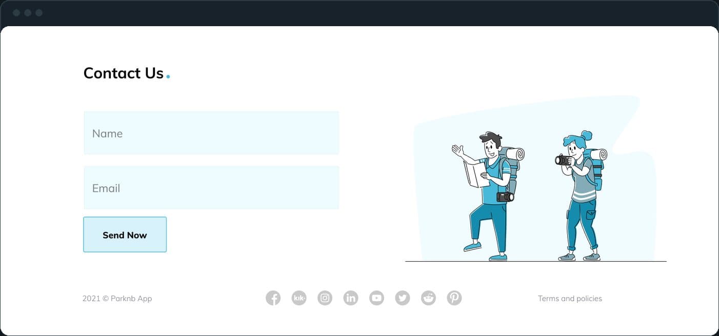
A contact form with name and email, the social links and the terms, above the footer dated 2021. The whole page runs hero, about, how it works, features, contact.
A landing page for an app shows the app. The Discover screen sits in a phone at the right of the headline, with the two store badges under the copy.
Three illustration directions for the same headline (parking, camping, gardening), so the client could choose the story; the page underneath does not change.
Eight features in a numbered two-column grid read as a list to scan, one illustration each, not a wall of identical cards.
Designed and built
One outcome per item, dated, or not disclosed: never an estimate.
An app for instant bookings of properties and events: parking spots, driveways, campsites, glamping spots and stays, with hosts on one side and travelers on the other. The landing page is the web side of it.
Yes. Plainbuilt designed and built the landing page, full stack. The app it presents is the client's product.
Yes. One page that says what the app does in the first screen, shows the app, explains it in steps, and ends in a form or the store badges. Book a working session and bring the app.