Skip to content

TellTail: a direct line to a vet from the phone

Mobile app development for TellTail, a veterinary telehealth app: 8 iOS screens, appointments, chat and a video call with the vet, built in under 6 months.

TellTail

The engagement

Client
TellTail
Industry
Veterinary telehealth
Year
To follow
Duration
Under 6 months
Delivered
8 screens, iOS: onboarding, home, an upcoming appointment, chat, a video call, health articles and settings, built full stack
Stack
To follow
Role
Full-stack development: design and build of the mobile app

TellTail is a veterinary telehealth app: the person keeps the next vet appointment on the home screen, reads the Top Vets list, messages the vet from the appointment card and joins a video call. Plainbuilt designed and built it full stack and delivered it in under 6 months: 8 iOS screens from the welcome slide to settings. The line the design rests on is on the welcome slide: a direct line of communication between vet and clinic.

Who is TellTail for?

Two ends of one line. On the screens, the person who opens the app: they search, keep an upcoming appointment with a vet, read the vet's specialty, years and rating, message or video-call, and read health articles on the Learn tab. On the other end, the vet: the app names each one, shows a photo, a specialty and a star rating, and the appointment screen counts the vet's patients. The welcome slide puts it in the product's own words: a direct line of communication between vet and clinic.

What did Plainbuilt build?

The app on iOS, designed and built full stack. A splash screen on the app mark. Onboarding as four slides with one title, one tagline and one Continue button, the illustration changing tile each time. A home with search, the Upcoming Schedule card and the Top Vets list. An upcoming appointment screen with the date chip, a price chip, an illustrated vet, the vet's card with a patient count and a video and a message button, a description and a red Cancel Appointment link. A conversation with the vet: sent and received bubbles with timestamps and read receipts, an image-attach button, a send button and a video-call button in the header. The full-screen video call. A Learn tab of illustrated health articles with a source credit each. And a settings list with password, a blocked list, notifications, location, terms, privacy, help and logout.

What does a consultation look like?

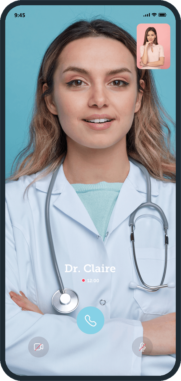
The person opens the app to the Upcoming Schedule card: the vet's name, the date and the time. The message button on the card's corner opens the conversation, where the header carries the vet's photo, the name and a video button. That button opens the call. The vet's feed fills the phone, the person's own camera sits in the top corner, and a timer runs under the vet's name. Three controls at the foot of the screen: hang up, camera off, mic off. The appointment screen carries the same video and message buttons on the vet's card, so the call starts from the appointment or from the chat.

Why is the appointment the home screen?

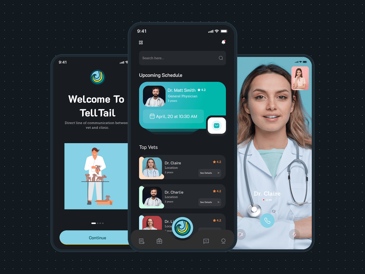
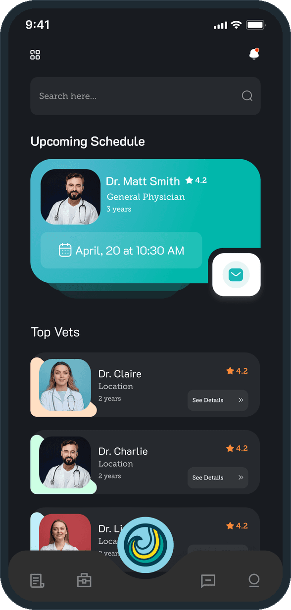
Because it is the one thing the person opens the app to check. The Upcoming Schedule card is the first block under the search field and the only filled shape on a dark screen: teal, with the vet's photo, the date and time in a chip, and the message button hanging off its corner. The Top Vets list waits under it for the person who has no appointment yet. The tab bar carries the rest of the app, with the mark in the middle slot, and nothing else competes with the card.

What is TellTail?

The welcome slide says it in the product's own words: a direct line of communication between vet and clinic. The app mark, a teal and yellow wave in a sky-blue circle, sits over the title, an illustrated vet with puppies fills the tile under it, and one Continue button moves on. Four slides carry the same words and cycle the illustration through the four brand tiles: sky blue, yellow, teal and deep teal.
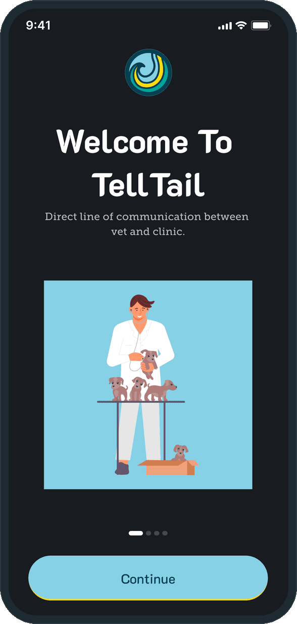
  • TellTail: What is TellTail?

What does the person see when they open the app?

A dark home with a search field, then one teal Upcoming Schedule card: the vet's photo, name, specialty and years, a star rating, the date and time, and a message button hanging off the card's corner. Under it, a Top Vets list where each row carries a rating, the years and a See Details button. The tab bar holds four icons around the app mark in the center.

  • TellTail: What does the person see when they open the app?

How does a consultation happen?

A full-screen video call with the vet. The vet's feed fills the phone, the person's own camera sits in the top corner, the vet's name and a running timer float over the picture, and three controls at the foot of the screen end the call or mute the camera and the mic. The same video button sits in the chat header and on the appointment card, so the call is one tap from either.

  • TellTail: How does a consultation happen?

Where are the health articles?

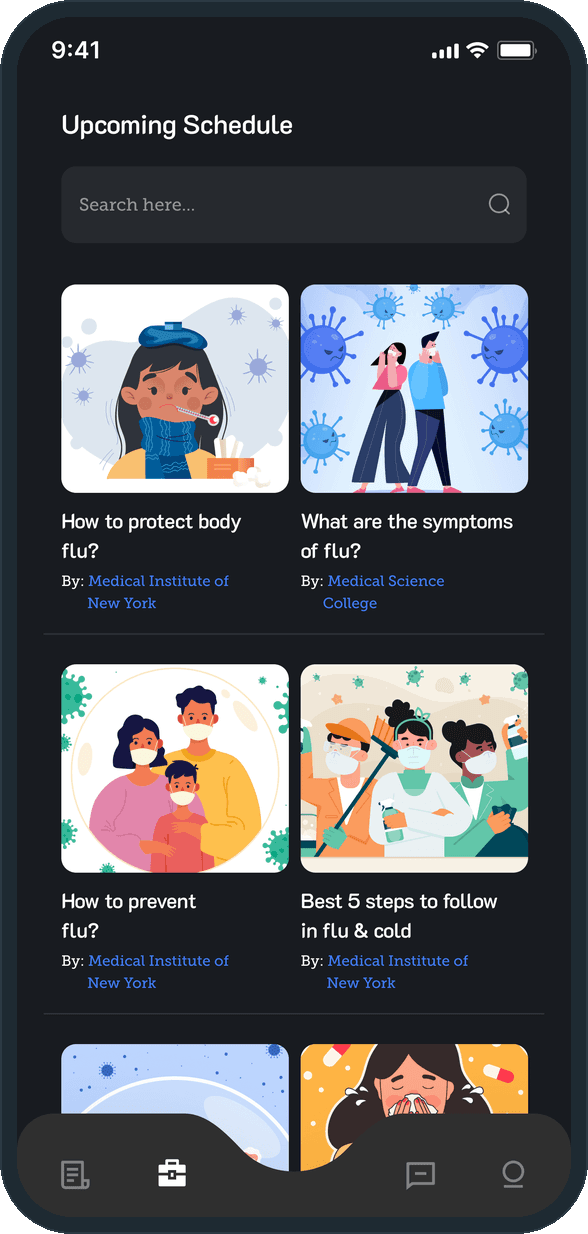
On a Learn tab: a search field over a two-column grid of illustrated articles, each with a title and a By: source credit. The grid scrolls under the tab bar, so the articles sit one tab away from the appointment and the chat.

  • TellTail: Where are the health articles?

How does the person manage the account?

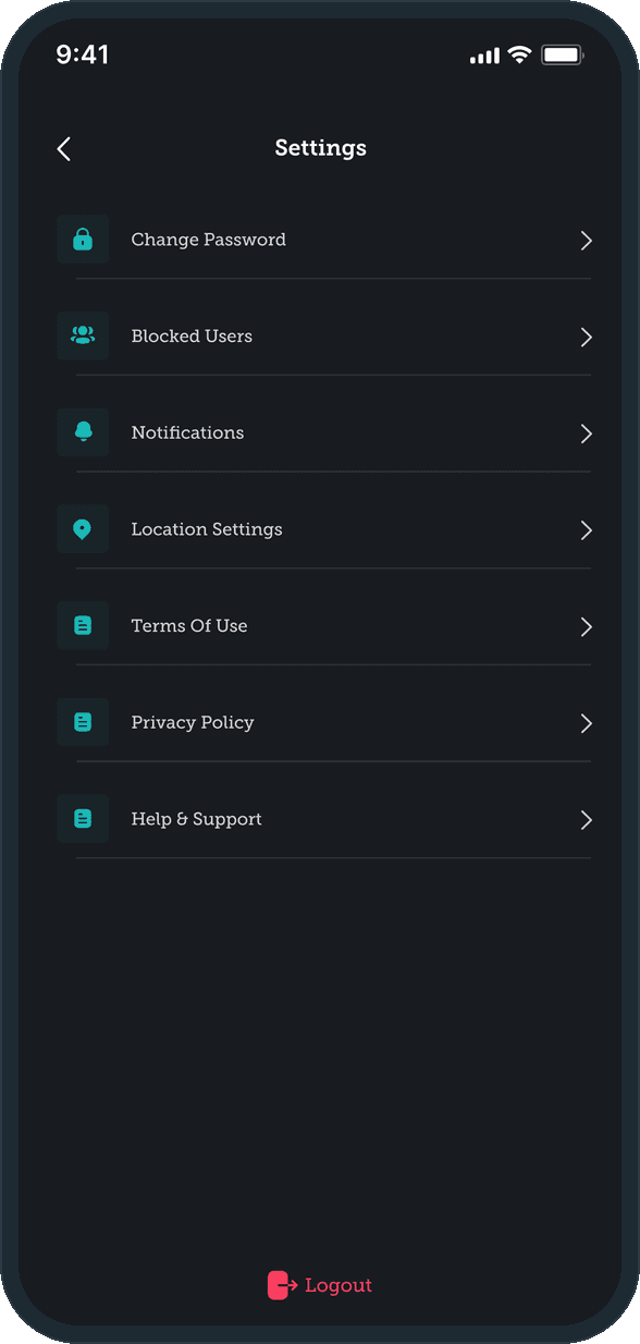
A plain settings list with a teal icon per row: change password, a blocked list, notifications, location settings, terms of use, privacy policy and help and support. Logout sits alone in red at the foot of the screen, the one row that ends something.

  • TellTail: How does the person manage the account?

The decisions

  • The next appointment is the home screen.

    The Upcoming Schedule card is the first thing under the search field and the one filled block on a dark home: the vet, the date and time, and a message button on its corner. The list of vets sits under it. What the person came to check is what they see first.

  • Teal talks, blue moves on, red ends.

    Teal carries the appointment card, the chat bubbles and the message and video buttons: everything that reaches the vet. Sky blue is the brand tile, the Continue button and the hang-up button. Red is kept for two rows only, Cancel Appointment and Logout.

  • The call fills the phone.

    On the video call nothing shares the screen with the vet: the feed runs edge to edge, the self view sits in a corner, the name and the timer float over the picture and three round controls sit at the foot. No header, no tab bar, nothing to read during a consultation.

  • The mark is the middle tab.

    The tab bar has five slots: four line icons and the app mark raised in the center, on every screen that carries a tab bar. The welcome slide and the splash screen open on the same mark, so one shape stands for the app from the first screen on.

What was the outcome?

Built and delivered in under 6 months

One outcome per item, dated, or not disclosed: never an estimate.

Which of our services apply

Common questions

Did Plainbuilt build TellTail?

Yes. Plainbuilt designed and built it full stack and delivered it in under 6 months.

Can Plainbuilt build a telehealth app like TellTail?

Yes. The same shape of build: an appointment card, a provider list, chat and a video call with the provider, and an articles tab. Book a working session to scope one.