Skip to content

Maestro: a telehealth app for patients and doctors

Mobile app development for Maestro, a telehealth app: 26 iOS screens, patient and doctor sides, video consults, intake and reports, built in under 6 months.

Maestro

The engagement

Client
Maestro
Industry
Telehealth
Year
To follow
Duration
Under 6 months
Delivered
26 screens, iOS, patient intake, booking, video consults, messages, reports and learning, a doctor side with appointments and a calendar, built full stack
Stack
To follow
Role
Full-stack development: design and build of the mobile app

Maestro is a telehealth app with a patient side and a doctor side. Plainbuilt designed and built it full stack and delivered it in under 6 months: 26 iOS screens covering patient intake, booking, video consults, messages, a reports vault and a Learn tab, with a doctor side for appointments, a calendar and messages. The design rests on one line: the patient and the doctor each get their own side of the same visit.

Who is Maestro for?

Two people on either end of a visit. The patient searches for a specialist or a health issue, books a slot, joins the video consult, messages the doctor and keeps reports and a health profile in the app. The doctor accepts or rejects requests, reschedules, sets the day's slots and takes the call from their own side.

What did Plainbuilt build?

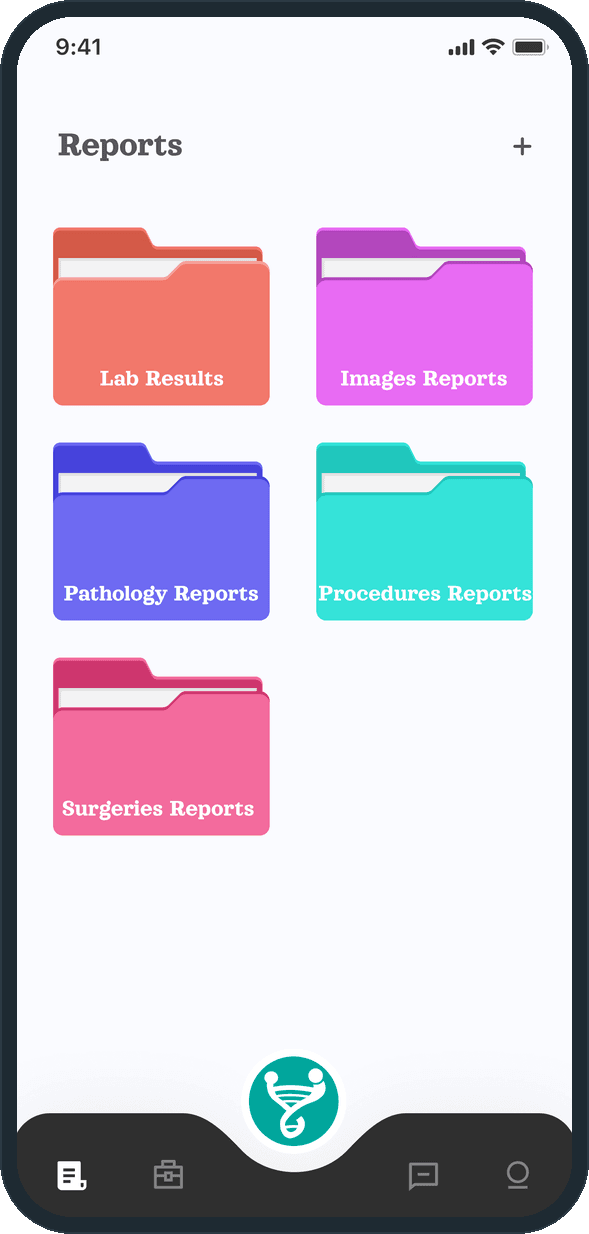
The patient side: onboarding, an eight-step profile setup (name, gender and birthday, blood group, medical history with report upload, medication, advance directives, height and weight), a home screen with search, specialty tiles, the next visit and a Top Doctors list, an appointment detail with video and message buttons, the video call, a message list, a Reports vault with five folders, a Learn tab with a video player, and a profile showing blood group, height, weight and age.

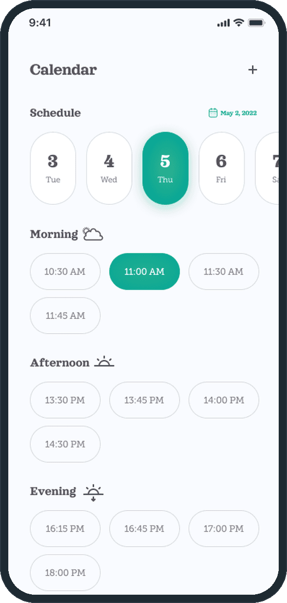
The doctor side: a five-step setup (name, specialty, area of practice, experience, address), an Appointments list with Upcoming, Pending and Completed tabs, a Calendar with Morning, Afternoon and Evening slots, a message list with a conversation view, and a profile with an intro and a videos tab. All of it designed and built by Plainbuilt, full stack.

What does the booking and consult flow look like?

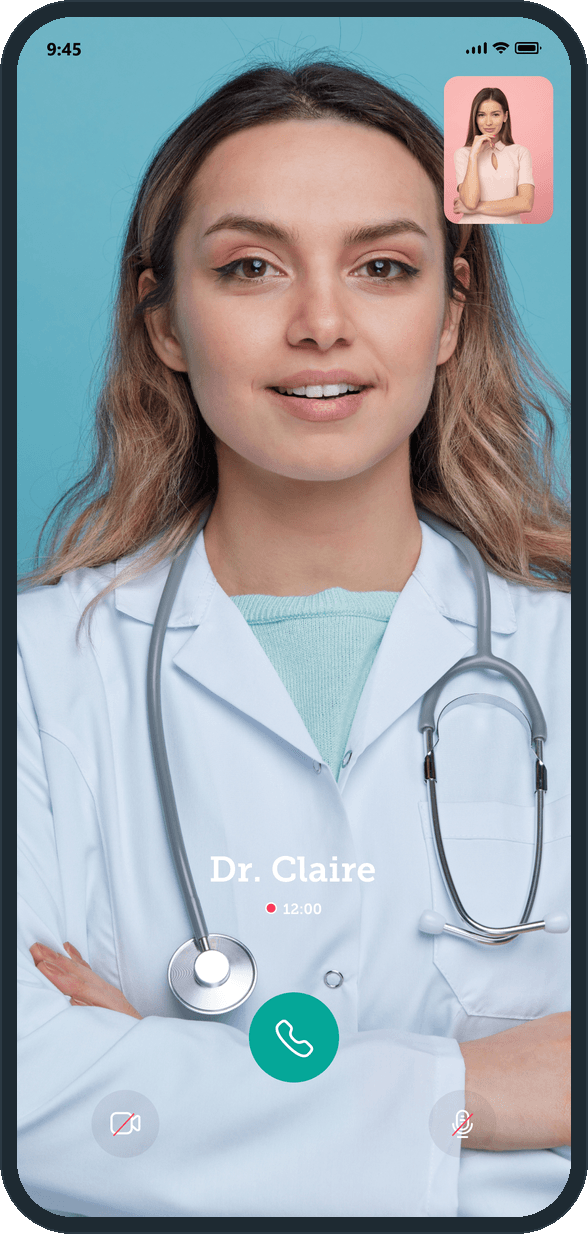
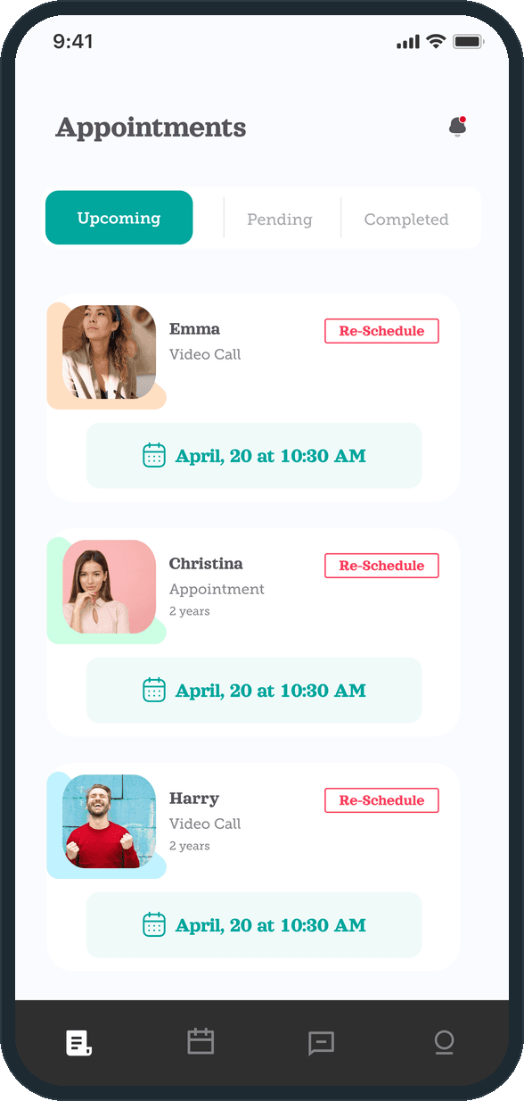
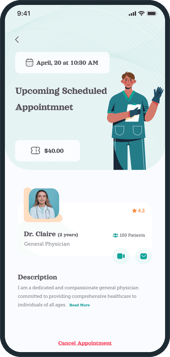
From the home screen the patient searches or picks a doctor from the Top Doctors list and taps See Details. The appointment detail shows the date and time, the fee and the doctor card, with a video button and a message button beside it. On the doctor's side a request sits under Pending with Accept and Reject; an accepted visit sits under Upcoming with Re-Schedule, and the same date chip shows on both sides. At the time of the visit the call opens full screen with the timer running and three controls under the doctor's face.

Why two tab bars?

The patient's tab bar has five positions: reports, learn, the raised Maestro logo button in the middle, messages and profile. The doctor's has four: appointments, calendar, messages and profile. Each side carries only the jobs that person has, so neither one steps around the other's screens.

How does a patient find a doctor and book a visit?

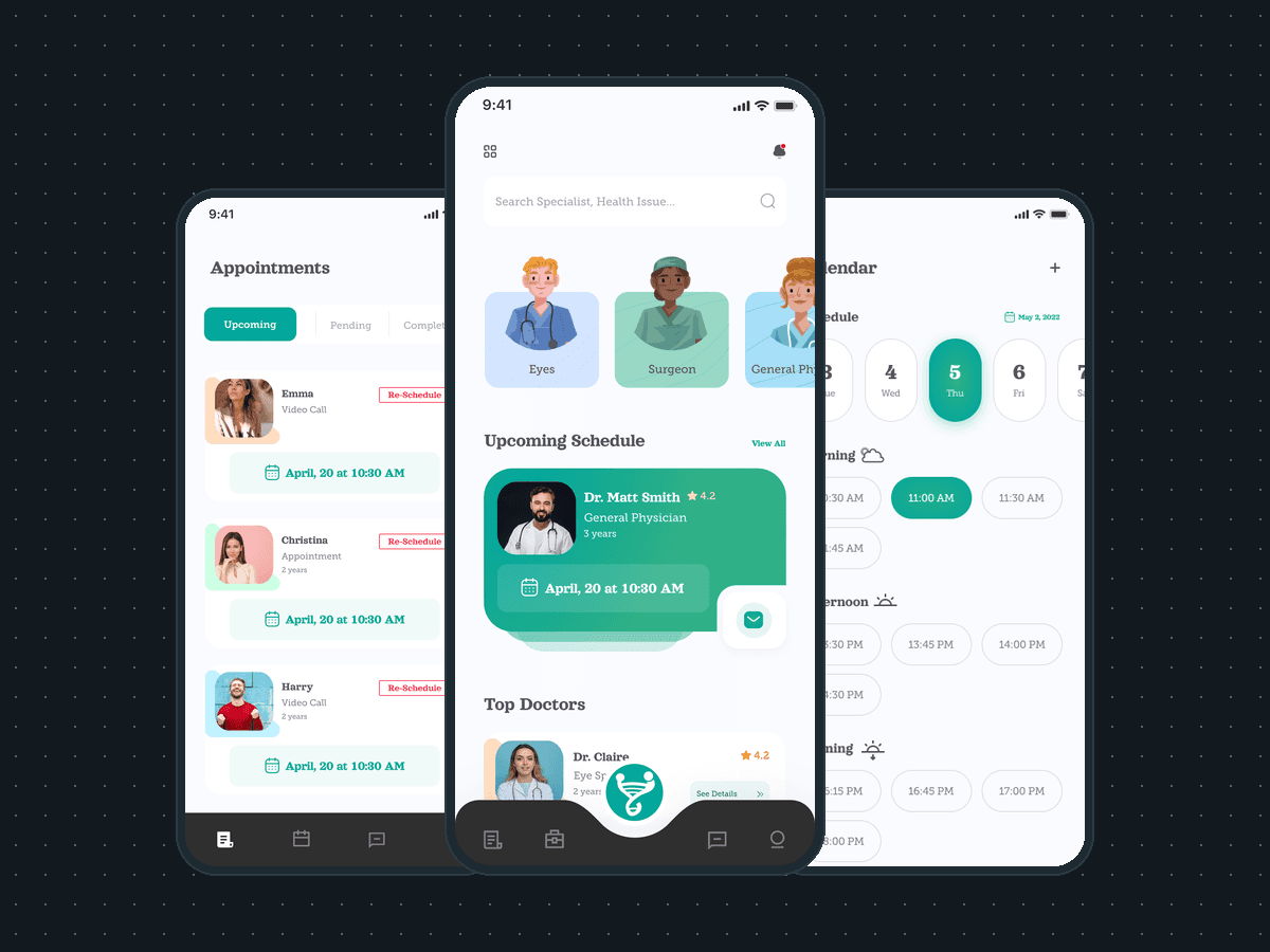
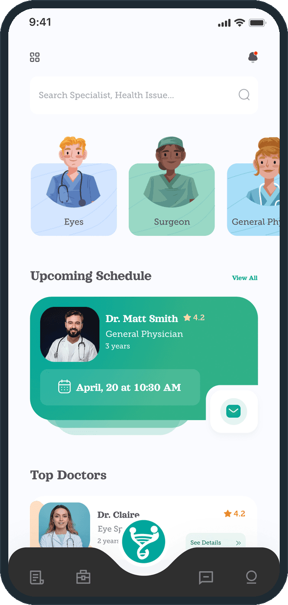
The home screen opens on a search for a specialist or a health issue, a row of specialty tiles and a Top Doctors list with a star rating and a count of years on each row. The next visit sits in a green card with its date and time. The appointment detail repeats the date, shows the fee and the doctor card with a video button and a message button, and ends on a Cancel Appointment link.
  • Maestro: How does a patient find a doctor and book a visit?
  • Maestro: How does a patient find a doctor and book a visit?

How does the video consult work?

The consult is a full-screen video of the doctor with the patient's own feed in the top corner. The doctor's name and a running call timer sit over the picture. Three controls and nothing else: end the call, turn the camera off, mute.

  • Maestro: How does the video consult work?

What does the doctor see on their side?

Doctors get their own side of the app. The Appointments list splits into Upcoming, Pending and Completed: a pending request carries Accept and Reject, an upcoming visit carries Re-Schedule, and each card names the patient and the visit type, Video Call or Appointment. The Calendar shows a date strip and the day's Morning, Afternoon and Evening slot chips, with a plus button at the top.

  • Maestro: What does the doctor see on their side?
  • Maestro: What does the doctor see on their side?

What health details does the app hold for a patient?

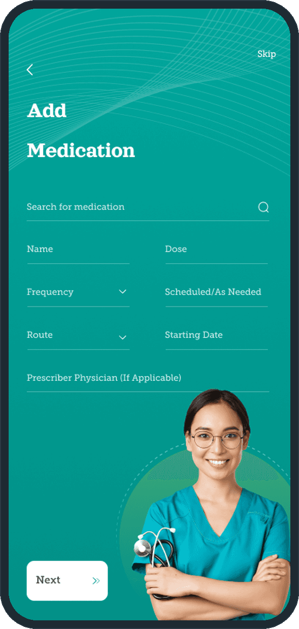
The intake walks the patient through eight steps on the teal stage: name, gender and birthday, blood group, medical history with report upload, medication, advance directives, height and weight. Five of the steps carry a Skip link; the name, height and weight steps carry only Next. The medication step asks for the name, dose, frequency, route, starting date and prescribing physician. After setup, the Reports tab keeps lab results, imaging, pathology, procedures and surgeries in five folders, with a plus button at the top.

  • Maestro: What health details does the app hold for a patient?
  • Maestro: What health details does the app hold for a patient?

Is there patient education inside the app?

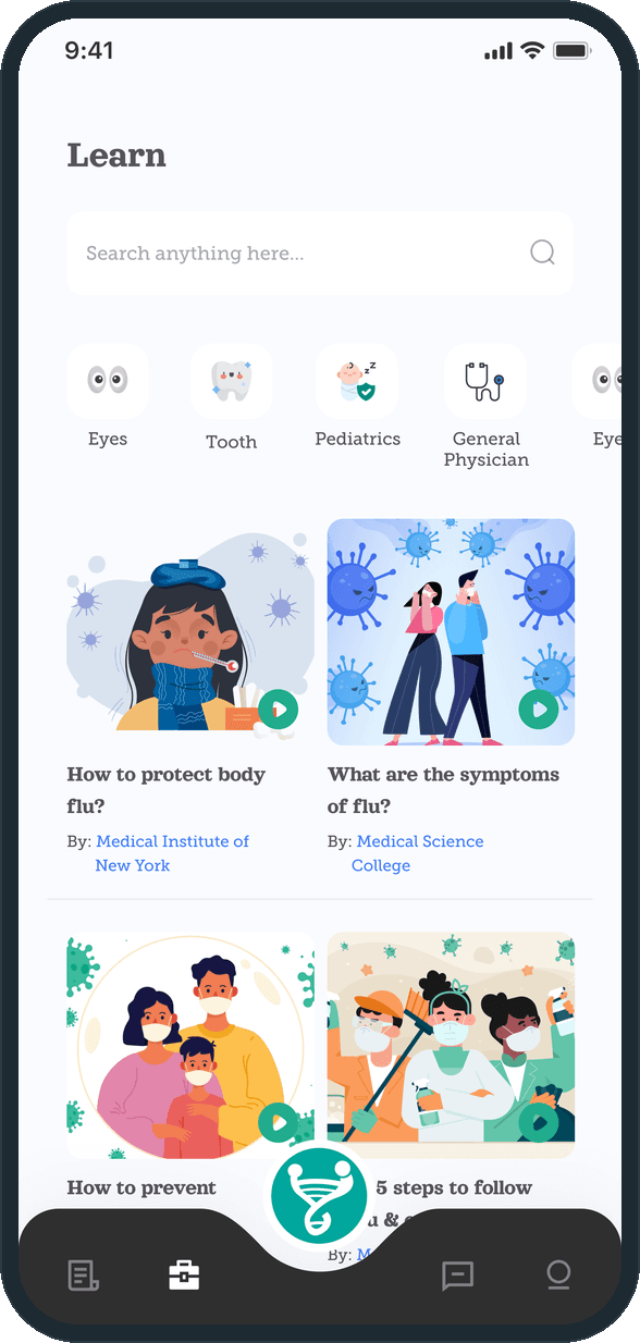
Yes. The Learn tab has a search, topic chips for Eyes, Tooth, Pediatrics and General Physician, and a grid of illustrated videos, most of them on flu and colds, each with a play button and a byline. A video opens into a player with a description and an Other Videos list.

  • Maestro: Is there patient education inside the app?

The decisions

  • Two sides, two tab bars.

    The patient and the doctor do different jobs, so each gets their own side. The patient's bar has five positions with the raised Maestro logo button in the middle; the doctor's has four: appointments, calendar, messages, profile.

  • The next visit sits above the doctor list.

    Under the search and the specialty tiles, the Upcoming Schedule card holds the next visit in green with its date, its time and a message button. Seeing the doctor already booked comes before finding a new one.

  • Intake as steps, not one long form.

    The health profile is eight screens on the teal stage, one topic each. Five of them carry a Skip link, so a patient can pass over blood group, medical history, medication or advance directives and keep going; the name, height and weight steps carry only Next.

  • The call screen has three controls.

    During the consult the doctor's video fills the screen, the patient's own feed sits in a corner, and the only controls are end call, camera off and mute. Nothing else competes with the doctor's face.

What was the outcome?

Built and delivered in under 6 months

One outcome per item, dated, or not disclosed: never an estimate.

Which of our services apply

Common questions

Did Plainbuilt build Maestro?

Yes. Plainbuilt designed and built it full stack and delivered it in under 6 months.

Can Plainbuilt build a telehealth app like Maestro?

Yes. The same shape: a patient side with intake, booking and video visits, a doctor side with appointments and a calendar, designed and built by Plainbuilt. Book a working session to scope one.