Skip to content

Recite: one app for contacts, files and reports

Mobile app design and build for Recite, an organizer: 35 iOS screens that keep contacts, files, reports, calls and emails in one place, built in under 6 months.

Recite

The engagement

Client
Recite
Industry
Personal organizer
Year
To follow
Duration
Under 6 months
Delivered
35 screens, iOS: onboarding, sign in and sign up, a home with a storage meter, contacts with email, message, call and file tabs, files and reports, folders, a card scan and payments, notifications, profile and settings, built full stack
Stack
To follow
Role
Full-stack development: design and build of the mobile app

Recite is an iOS app that keeps a person's contacts, files and reports in one place, with each contact's emails, messages, calls and files under their name. Plainbuilt designed and built it full stack and delivered it in under 6 months: 35 screens, from onboarding and sign-in to the storage meter, the card scan and the payments list. The design rests on one line from the splash screen: It's all here.

Who is Recite for?

A person with a lot to keep track of: the contacts they deal with, the files and reports that belong to each of them, and the calls, messages and emails in between. Each contact carries a case number under the name and place, so the app suits work that runs case by case; the screens do not say which trade that is. The storage is paid, so the person is buying a place to keep all of it, with a meter that shows how much of it is used.

What was the problem?

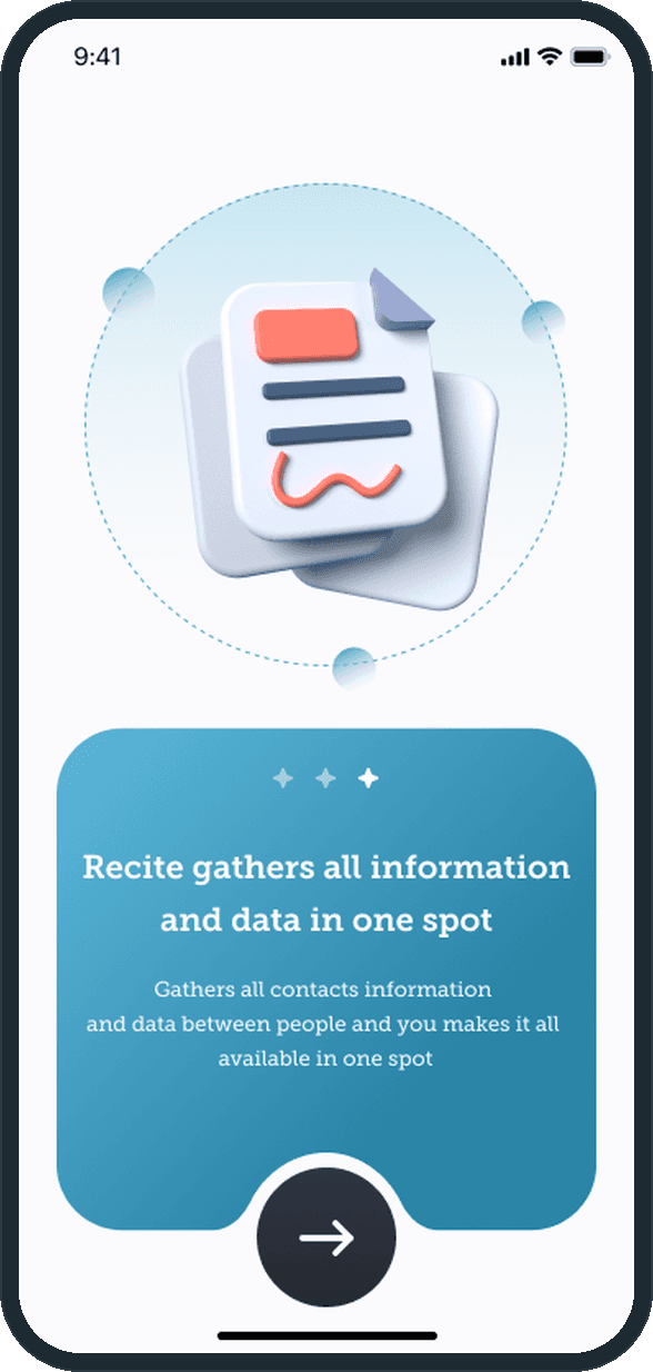
The onboarding's three slides frame it in the app's own words: organize and manage contacts, handle files and reports, and gather all information and data in one spot. The information about one person is otherwise spread across the phone's contacts, its mail, its messages, its call log and a file app, with nothing that ties them to the person or to the matter. Recite's answer is to put the person first and hang everything else off them.

What did Plainbuilt build?

The whole app, as the screens show it. Onboarding, sign in and sign up with an email and password or a Google, Facebook or Apple account, a 4-digit email verification, forgot and set password, and profile set-up. A home screen with the storage ring, the counts and the recently browsed files. Contacts with Personal and Business tags, an A to Z index and a sort control, each contact with Emails, Messages, Calls and Files tabs, plus add and link contacts. Files and reports in list or grid view with a share sheet, folders with a path and an icon, file access per contact, and a confirmation before every delete. Payment cards added by form or by camera scan, a card carousel with the transactions under it, and linked bank accounts. Notifications, a profile with linked social accounts, settings with FAQ, email support, push notifications and auto updates, change password, privacy policy, terms and about. The screens share the same dark slate and paper and the same serif type.

Why is the contact the center of the app?

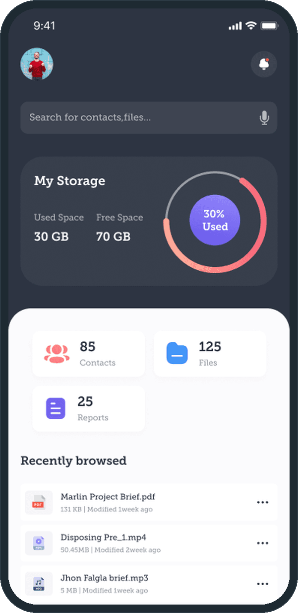
Because that is how the material arrives. A file comes from someone, a call is with someone, a report is about someone's case. Recite makes the contact the page everything hangs off: the Emails, Messages, Calls and Files tabs sit under the person's name, and adding a file or a folder asks which contacts to link it to and which of them may open it. The home screen's three counts, 85 contacts, 125 files and 25 reports, are the same three things seen from the top.

What does Recite keep in one place?

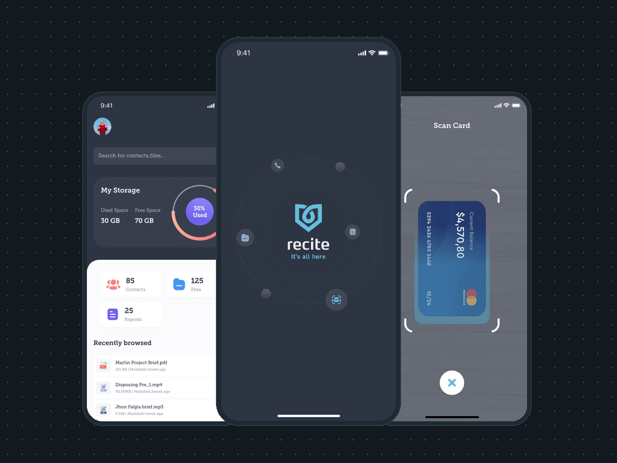
Contacts, files and reports, with the calls, messages and emails that belong to each contact. The onboarding says it in the app's own words: Recite gathers all information and data in one spot. The home screen shows the storage ring at 30% used, 30 GB used and 70 GB free, then the counts of 85 contacts, 125 files and 25 reports, then the files browsed most recently. The plus button adds a contact, a file or a folder.
  • Recite: What does Recite keep in one place?
  • Recite: What does Recite keep in one place?

How does a contact's history stay together?

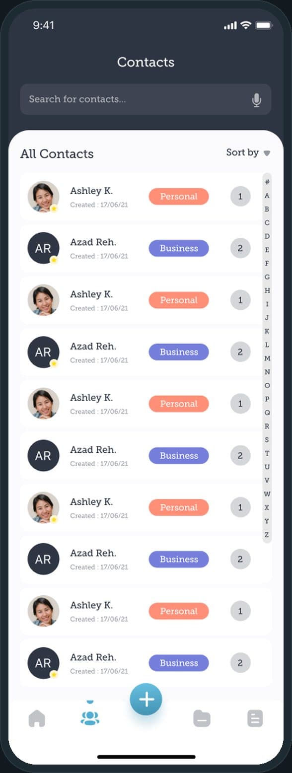
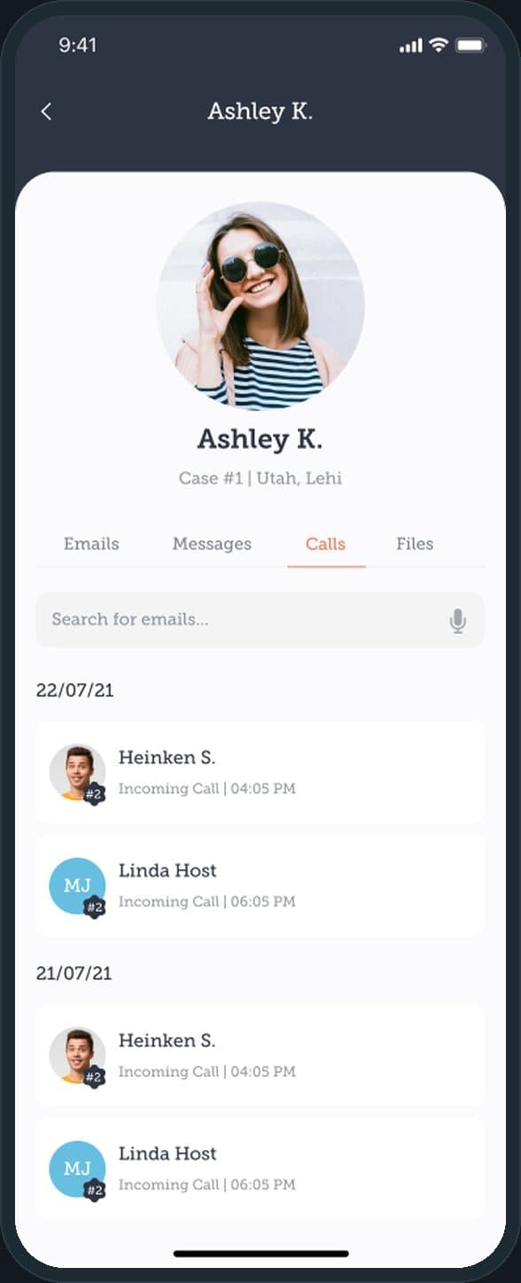
Every contact carries a Personal or Business tag, the date it was created and a count, with an A to Z index down the side and a sort control. A contact's own page holds four tabs, Emails, Messages, Calls and Files, so every exchange with that person sits under their name and case number, with the calls grouped by day.

  • Recite: How does a contact's history stay together?
  • Recite: How does a contact's history stay together?

How is a payment card added?

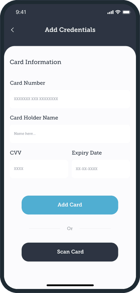
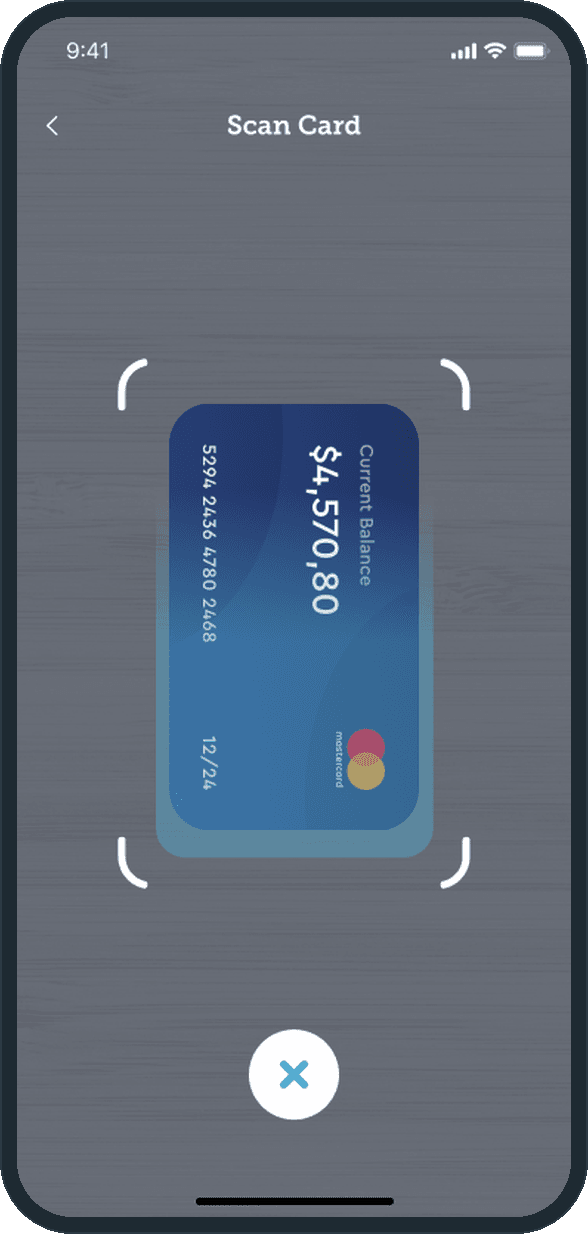
Two ways. The form takes the card number, the holder's name, the CVV and the expiry, or the person taps Scan Card and the camera frames the card between four corner guides. After a scan the app shows the card it read and asks the person to verify the details before Add Card. The card pays for the storage: the payments screen lists the cards and the storage bills paid from them.

  • Recite: How is a payment card added?
  • Recite: How is a payment card added?

What can be done with a file?

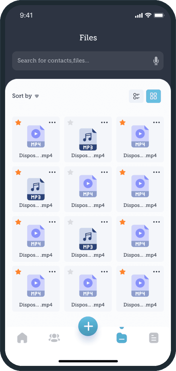
Files and reports each have a tab, shown as a list or a grid with a sort control. The grid shows each file's type badge, a star for a favorite and a three-dot menu; the list adds the size and when it was modified. The menu opens the file's sheet: share it with a contact or through the phone's own share options, or rename, copy, move or delete it, with a confirmation before a delete. The plus button adds a file, links it to contacts and sets which of them may open it.

  • Recite: What can be done with a file?

What does the brand look like?

A shield mark holding a loop, the lowercase recite wordmark in white and the line It's all here in sky blue, all on dark slate. Around the mark, four small icons sit on dotted rings: a phone, a folder, a report and a card scan, the four things the app keeps. The same slate and blue carry through the headers, the storage card and the primary buttons.

  • Recite: What does the brand look like?

The decisions

  • The contact is the page everything hangs off.

    A contact's page is the unit of the app: emails, messages, calls and files sit under the person, in four tabs, rather than in four separate apps. A case number sits under the name and place, so the material for one matter is one tap from the person it belongs to.

  • The storage meter comes first.

    Storage is the thing the person pays for, so the ring shows used and free space at the top of the home screen, above the counts and the recent files. The number is plain: 30 GB used, 70 GB free, 30% used.

  • Scan the card, then verify it.

    The camera reads the card, and the typed form stays as the other route. The app does not take the scan on trust: it shows the card it read above the form and asks the person to verify the number, the name, the CVV and the expiry before Add Card.

  • Dark for the frame, paper for the content.

    Headers, the search field and the storage card sit on dark slate; the lists, forms and cards sit on off-white paper with rounded tops, so the person's own material is the light part of every screen. Sky blue marks the primary action; coral tags Personal and periwinkle tags Business.

What was the outcome?

Built and delivered in under 6 months

One outcome per item, dated, or not disclosed: never an estimate.

Which of our services apply

Common questions

Did Plainbuilt build Recite?

Yes. Plainbuilt designed and built it full stack and delivered it in under 6 months.

What does Recite do?

It keeps a person's contacts, files and reports in one app on the phone, with each contact's emails, messages, calls and files under their name. Storage is paid and metered on the home screen, and a payment card is added by form or by camera scan to pay for it.