Skip to content

Myebooth: a marketplace app for sellers and buyers

Mobile app development for Myebooth, a two-sided marketplace: 16 iOS screens, a seller side with store and sales, a buyer side with orders, in under 6 months.

Myebooth

The engagement

Client
Myebooth
Industry
Online marketplace
Year
To follow
Duration
Under 6 months
Delivered
16 screens, iOS, a seller side and a buyer side, sign-in, store setup, sales and orders, built full stack
Stack
To follow
Role
Full-stack development: design and build of the mobile app

Myebooth is a two-sided marketplace app. Sellers set up a store, list products and run regular, sponsored or bumped sales; buyers browse featured items, save favorite shops and track pending and completed orders, with local pickup or shipping on each item. Plainbuilt designed and built it full stack and delivered it in under 6 months: 16 iOS screens across a seller side and a buyer side. The design rests on one home shared by both sides.

Who is Myebooth for?

Two kinds of people. A seller, who opens a store, lists products, runs sales and holds a membership. A buyer, who searches, browses featured items, keeps favorite shops and orders, with local pickup or shipping on each item. A guest can look around first: Continue as a guest sits on the entry screen and again under the login button.

What did Plainbuilt build?

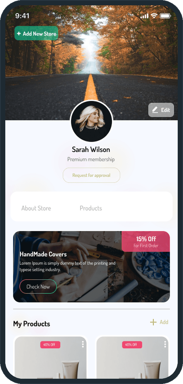
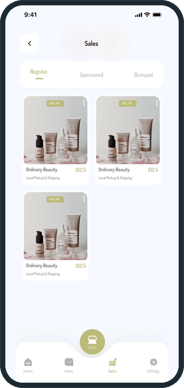
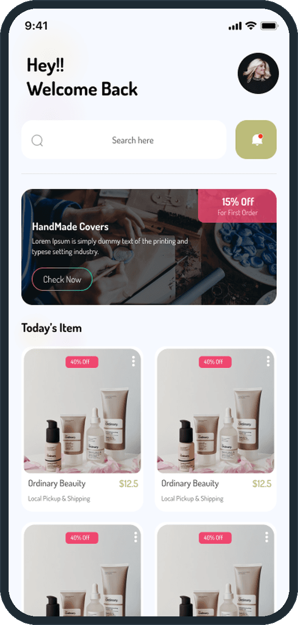
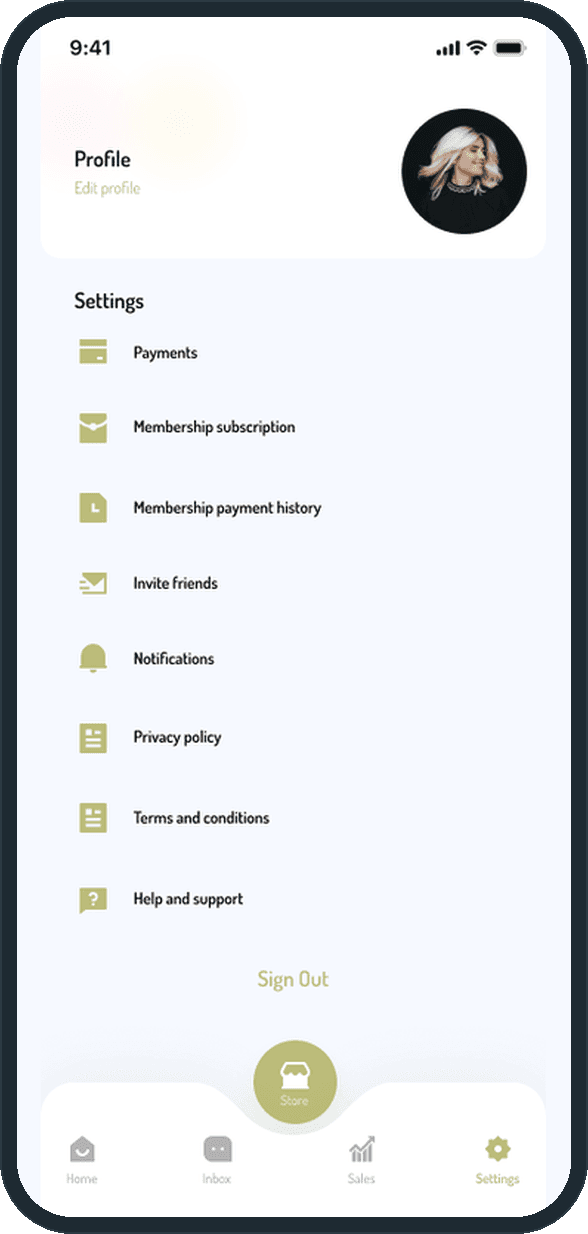
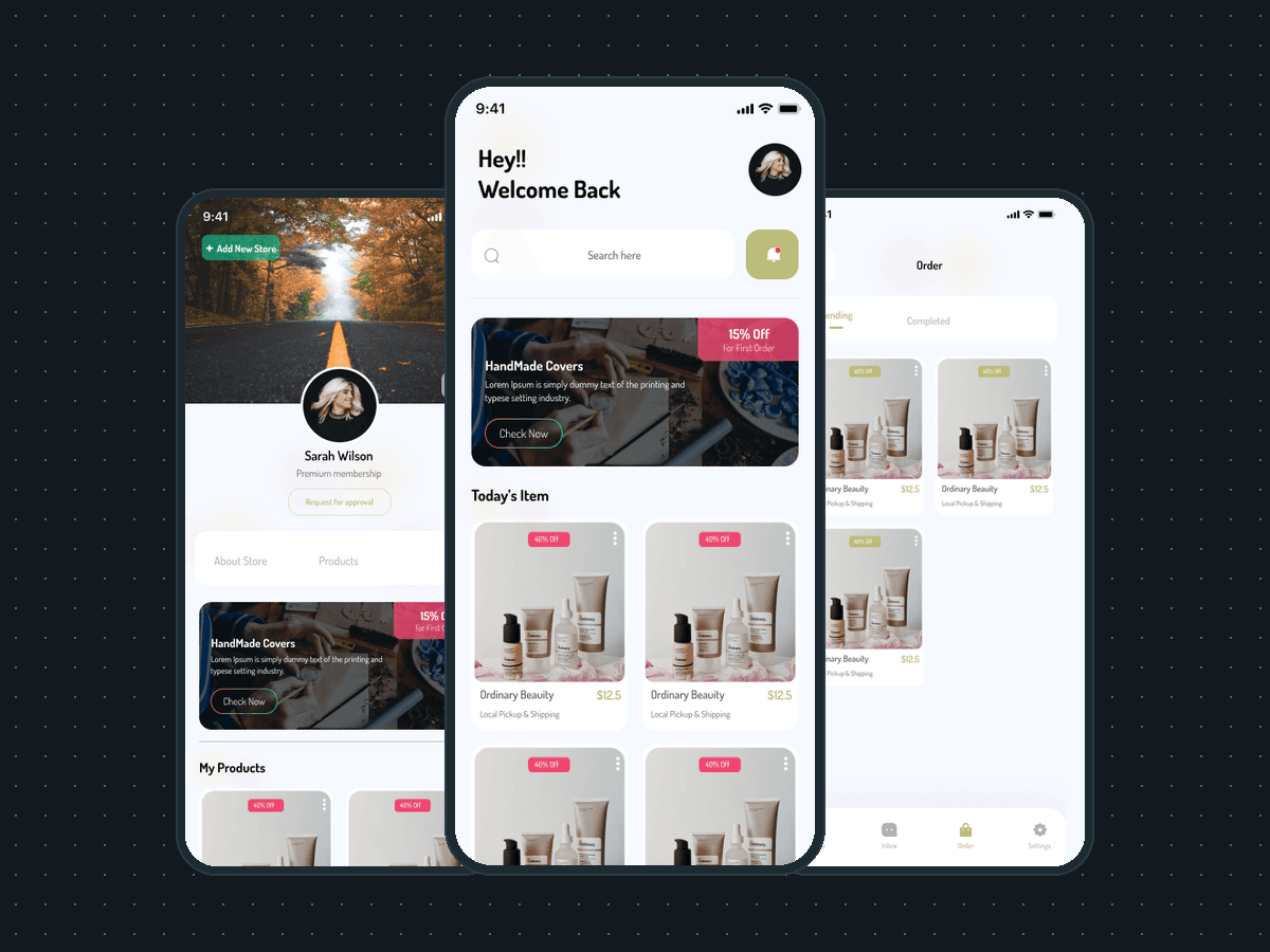
The whole app, front to back. On the seller side: a home headed Today's Item, an Inbox tab, a store page with a cover photo, an avatar, a membership tier and a Request for approval button, About Store and Products tabs, a My Products grid with an Add tile, a Sales screen with Regular, Sponsored and Bumped tabs, and settings with Payments, Membership subscription and Membership payment history. On the buyer side: a home with search, a filter control, a promo banner, Featured Items and Favorite Shops, an Inbox tab, an Order screen with Pending and Completed tabs, and settings without the membership rows. In front of both: three onboarding screens, an entry screen with Sign In, Sign Up and Continue as a guest, a login with email and password or Facebook, Google and Apple, a terms screen and notifications.

What does the selling flow look like?

Add New Store sits at the top of the store page. The About Store tab holds an About block, Locations with Mark in map, Share my store, Coupons with an Edit control and the store policies on returns and handling time. A Request for approval button sits under the seller's name. Products go in from the Add tile on the My Products grid, and the Sales screen lists them under Regular, Sponsored or Bumped.

Why do both sides share one home?

Because the two sides are the same product seen from two ends. The search bar, the promo banner and the product grid sit in the same places on both homes; the buyer's adds a filter control and a Favorite Shops row, the seller's swaps the Order tab for Store and Sales. One layout to build, one to learn.

What does a buyer see?

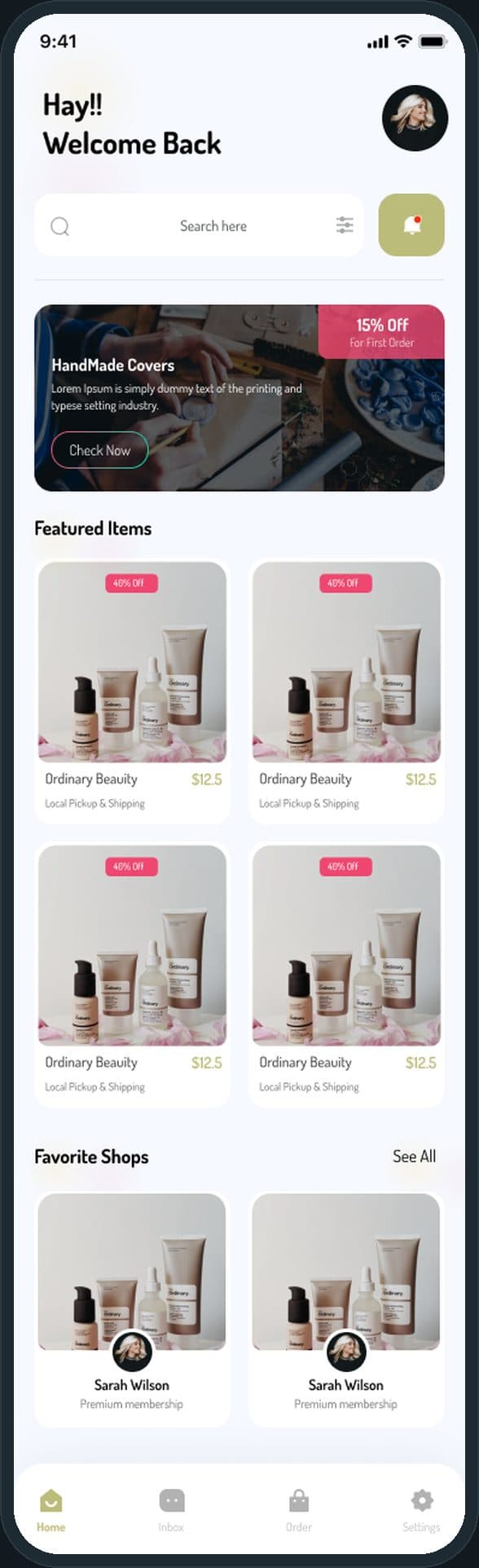
The whole home, top to bottom: a search bar with a filter control, a promo banner with 15% off a first order, Featured Items priced with a 40% Off badge and marked Local Pickup & Shipping, then Favorite Shops with a See All link. The tab bar is Home, Inbox, Order and Settings.
Myebooth: What does a buyer see?

How does a buyer track an order?

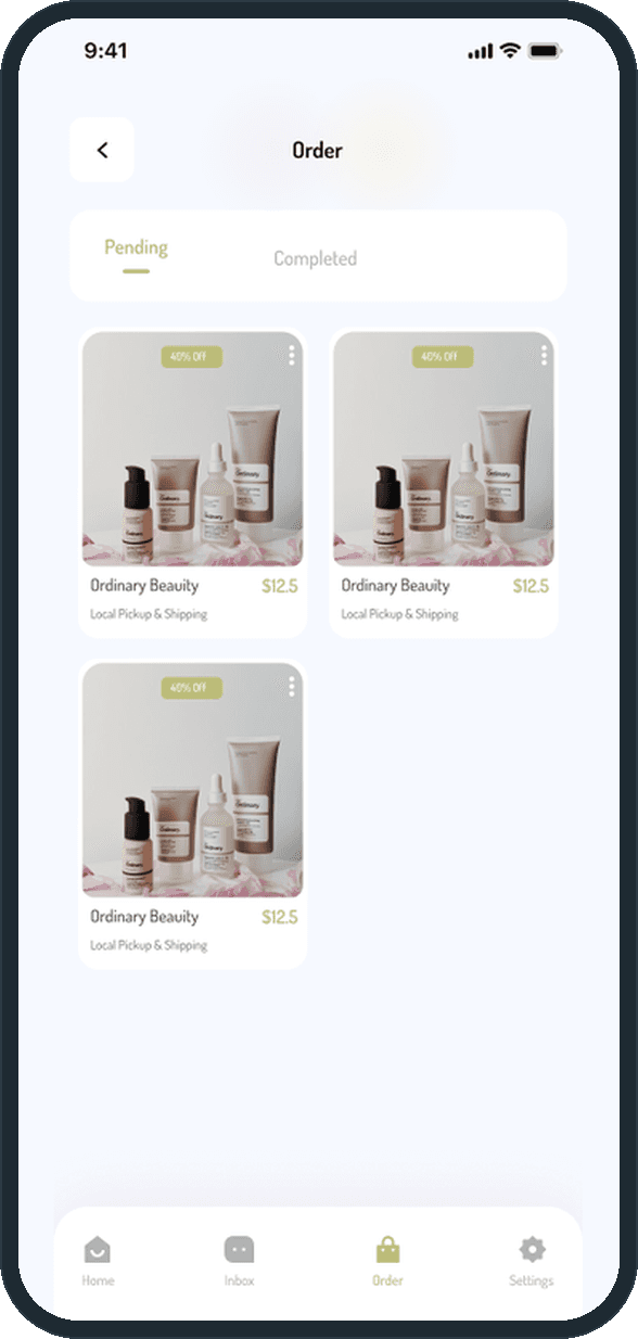
The Order tab opens two lists, Pending and Completed. Each order is the same card as the home: the photo, the 40% Off badge, the name, the price and Local Pickup & Shipping, so a buyer reads an order the way they read a listing.

  • Myebooth: How does a buyer track an order?

How does a seller run a store?

From the store page: a cover photo, an avatar, the membership tier, a Request for approval button, an Add New Store action, and the About Store and Products tabs over a My Products grid with an Add tile. The Sales screen groups the seller's listings into Regular, Sponsored and Bumped, with the Store button raised in the middle of the tab bar.

  • Myebooth: How does a seller run a store?
  • Myebooth: How does a seller run a store?

How is the seller side different from the buyer side?

The seller's home keeps the buyer's search, promo banner and product grid, headed Today's Item instead of Featured Items, without the filter control. The seller's tab bar carries Store and Sales where the buyer's carries Order. The seller's settings add Membership subscription and Membership payment history next to Payments; the buyer's settings drop both rows.

  • Myebooth: How is the seller side different from the buyer side?
  • Myebooth: How is the seller side different from the buyer side?

The decisions

  • Two sides, one home.

    The seller's home and the buyer's home share the search bar, the promo banner and the product grid; only the heading and the tab bar change. Whichever side someone signs in on, the first screen is the same shape.

  • The store is a page, not a form.

    A seller's store has a cover photo, an avatar, a membership tier and two tabs, About Store and Products. It reads like the storefront a buyer visits from Favorite Shops, and the seller edits it in place with the Edit button.

  • Sales grouped by how they are promoted.

    The Sales screen has three tabs: Regular, Sponsored and Bumped. A seller sees which listings are paid for and which are not, with no filter to set.

  • The store sits in the middle of the tab bar.

    On the seller side the Store button is a raised disc between Inbox and Sales, on every seller screen. A seller reaches the store in one tap from anywhere; the buyer's bar has four flat tabs and no disc.

What was the outcome?

Built and delivered in under 6 months

One outcome per item, dated, or not disclosed: never an estimate.

Which of our services apply

Common questions

Did Plainbuilt build Myebooth?

Yes. Plainbuilt designed and built it full stack and delivered it in under 6 months.

Can Plainbuilt build a marketplace app like Myebooth?

Yes. The same shape of work: a seller side, a buyer side, sign-in with guest access and the order flow, designed and built full stack. Book a working session to scope one.