Skip to content

Pax: a booking app for group trips built by planners

Pax, a travel booking app: 11 iOS screens for onboarding, the planner setup, browsing, a day-by-day itinerary, checkout and payment, built in under 6 months.

Pax

The engagement

Client
Pax
Industry
Travel booking
Year
To follow
Duration
Under 6 months
Delivered
11 screens, iOS, onboarding, the planner setup, sign-up, browse, a trip page with a day-by-day itinerary, checkout and payment, built full stack
Stack
To follow
Role
Full-stack development: design and build of the mobile app

Pax is a travel booking app. Travelers browse group trips built by itinerary planners, read the plan day by day, book and pay in the app; planners earn when people book with them. Plainbuilt designed and built it full stack and delivered it in under 6 months: 11 iOS screens covering onboarding, the planner setup, sign-up, browsing, the trip page, checkout and payment. One idea runs through it: read the trip day by day, then book from the same screen.

Who is Pax for?

Two kinds of person. The traveler opens the app to a greeting by name, a search bar for any destination and a trip card with the place, the price, the tour, its rating and its dates; five tabs, Home, Explore, Trips, Wishlist and Profile, hold the rest. The itinerary planner is anyone who enjoys planning: the planner intro invites them to create a group itinerary, share it with old friends and new friends, and earn when people book with them.

What did Plainbuilt build?

The whole app, front to back, as the screens show it. Three onboarding cards: browse travel content, confirm your travel, prepare for your trip. Sign-up by email or phone, with first and last name, email and password, the Terms and Privacy Policy links, or with a Google, Apple or Facebook account. Home with the search bar, the trip card, the wishlist heart and the map button. The trip page with the cover photo and the thumbnail strip, the location, the price per person, the planner's name and rating, a Description tab and an Itinerary tab with the day-by-day timeline, and Book Now. Checkout with the trip summary, the traveler's details, a saved card and the Pay bar, then the payment confirmation with its order number. On the planner side, the intro and the four-step setup: the plan, the photos and video, publishing with pricing from Pax, and the booking details.

What does the booking flow look like?

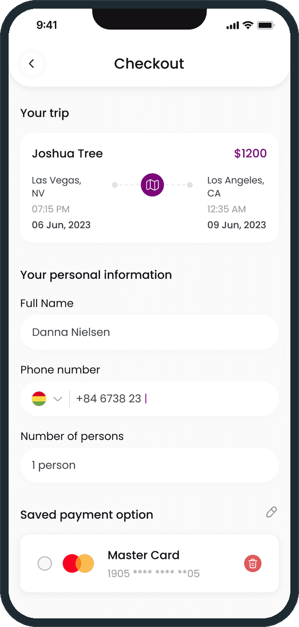
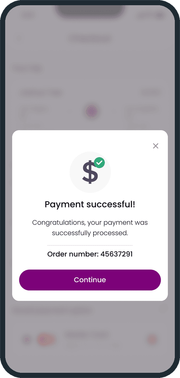
From the trip page, Book Now opens the checkout. The trip sits at the top as a card with the route, the departure and arrival times and the dates. Under it, the traveler's full name, a phone number with a country picker and the number of persons, then the saved payment option with a card on file and a delete control. The total price in USD sits beside Pay in a bar fixed at the bottom. After payment a modal confirms it with an order number and a Continue button.

Why keep Book Now fixed at the bottom?

Because the itinerary is long and the decision comes at the end of it. The trip page scrolls through the photo, the price, the planner and three days of entries; the button stays put the whole way, so the person never scrolls back up to book. Checkout does the same with the total and Pay. On Home, the card itself does that job: the price and the dates sit on the photo.

What does a traveler see when they open Pax?

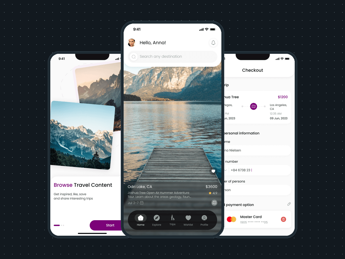
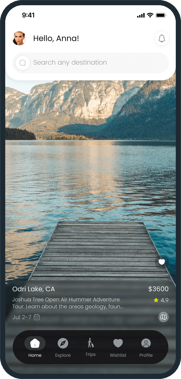
A greeting by name, one search bar for any destination and a full-screen trip card: the place, the price, the first lines of the tour, its star rating and its dates, a heart to wishlist it and a map button. Five tabs along the bottom: Home, Explore, Trips, Wishlist, Profile. The photo takes the whole screen because the trip is the product; the words sit on a dark band over it.
  • Pax: What does a traveler see when they open Pax?

How does a trip show its plan before you book?

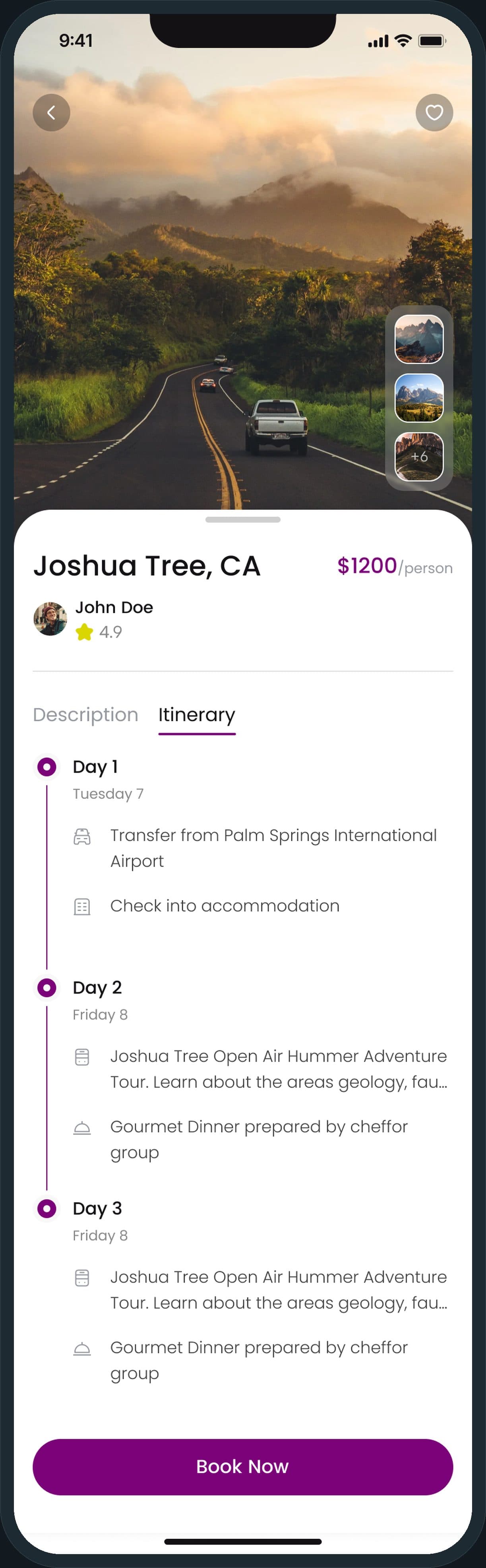
The trip page opens on the cover photo with a thumbnail strip, then the location, the price per person and the planner's name and rating. Two tabs, Description and Itinerary: the itinerary is a day-by-day timeline with an icon per entry, the transfer from the airport, the check-in, the tour, the dinner. Book Now stays fixed at the bottom while the plan scrolls, so the person reads the whole trip and books from the same screen.

Pax: How does a trip show its plan before you book?

How does booking and payment work?

Checkout shows the trip as a summary card with the route, the times and the dates, then asks for the traveler's full name, a phone number with a country picker and the number of persons. A saved card sits under Saved payment option. The page ends in a bar fixed at the bottom, below this frame, with the total in USD beside the Pay button. A modal confirms the payment with an order number and a Continue button.

  • Pax: How does booking and payment work?
  • Pax: How does booking and payment work?

Who builds the trips, and how do they get paid?

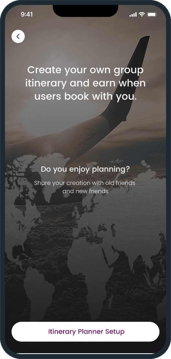
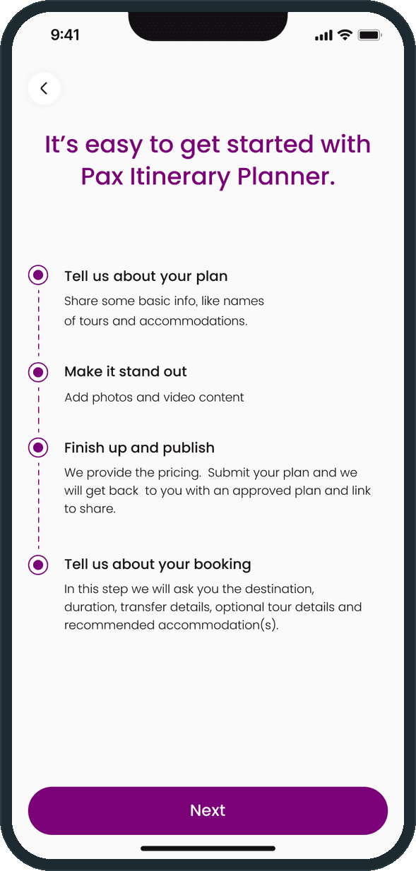
Anyone who enjoys planning. The planner intro sits over a plane-wing photo and a world map: create your own group itinerary and earn when people book with you, and share it with old friends and new friends. Setup is a four-step timeline: tell us about your plan (the names of tours and accommodations), make it stand out (photos and video), finish up and publish (Pax provides the pricing and returns an approved plan with a link to share), and tell us about your booking (the destination, the duration, the transfers, optional tours and recommended accommodation).

  • Pax: Who builds the trips, and how do they get paid?
  • Pax: Who builds the trips, and how do they get paid?

What does the app promise a traveler on first open?

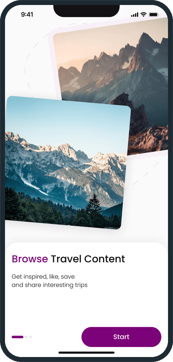
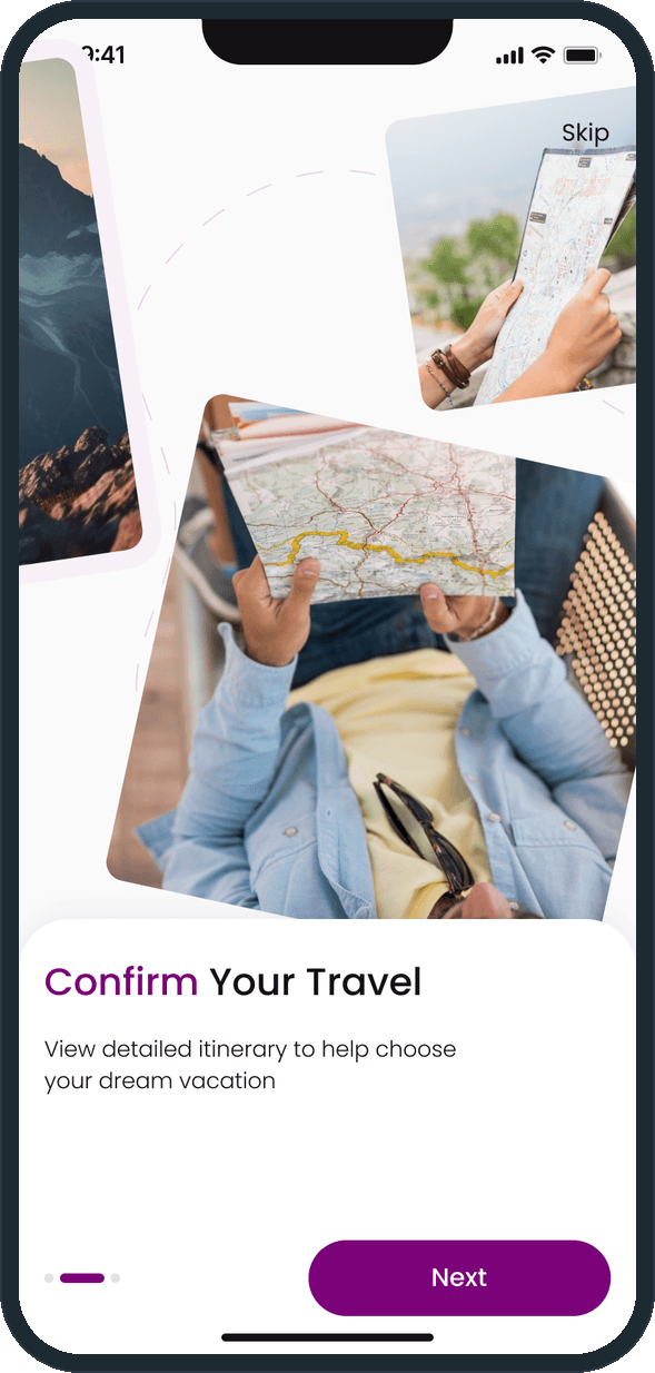
Three onboarding cards, each a set of tilted photos on a dashed arc; the first ends in a Start button, the next two in a Skip link and a Next button. The cards promise three things: browse travel content (get inspired, like, save and share interesting trips), confirm your travel (view the detailed itinerary to help choose your dream vacation) and prepare for your trip (know who you are traveling with in advance and chat with group members before travel). The first two cards are shown here.

  • Pax: What does the app promise a traveler on first open?
  • Pax: What does the app promise a traveler on first open?

The decisions

  • The photo is the screen.

    On Home the trip photo fills the phone and the words sit on a dark band at the bottom: the place, the price, the rating, the dates. The search bar sits in the white header at the top. A trip is sold by where it goes, so the picture gets the space.

  • The itinerary is a timeline, not a paragraph.

    The trip page keeps a Description tab and an Itinerary tab. The itinerary is a day-by-day list with a purple dot per day and an icon per entry: the transfer, the check-in, the tour, the dinner. The person sees what happens on which day before paying.

  • Book Now never scrolls away.

    On the trip page the button is fixed at the bottom while the itinerary scrolls; at checkout the total and the Pay button sit in the same fixed bar. The next step is always in the same place.

  • Two sides, one app.

    The traveler's onboarding and the planner's intro sit in the same app. A planner sets up an itinerary in four steps, Pax provides the pricing and approves the plan, and the planner earns when people book with them. Both sides share the purple accent, the type and the buttons.

What was the outcome?

Built and delivered in under 6 months

One outcome per item, dated, or not disclosed: never an estimate.

Which of our services apply

Common questions

Did Plainbuilt build Pax?

Yes. Plainbuilt designed and built it full stack and delivered it in under 6 months.

What can a traveler do in Pax?

Search any destination; browse trips as full-screen cards with the place, the price, the rating and the dates; wishlist a trip with the heart; open it to read the description and the day-by-day itinerary; then book it with a name, a phone number and the number of persons, pay with a saved card, and get an order number on the confirmation.